There’s a tiny quirk with the TTG Add to Cart dialog box. Some of the styling comes from a file named modal.css (from ttg-be/cart/lib/css/) and some of it comes directly from the style-common.css file of the gallery from which your clients are purchasing prints (or from the style-common.css file for the site if you’re using the Shared Resources feature).
The styling I’m specifically concerned with is the code that controls the text color.
Under a certain circumstance, some of the text in the Add to Cart box will appear to be missing. What’s really happening is that the text is the same color as the background of the box.
This will happen when you’ve chosen white (or a very light color) for the font color of the gallery (or your site, if using Shared Resources).
One solution is to change the font color of your gallery (or site if using Shared Resources). That may not be possible if you’re committed to a dark background for the site.
Another solution is to use custom CSS to alter the styling of the text that’s become invisible, the styling coming from the gallery. This is the easiest solution that requires the least code.
To use custom CSS you’ll need to enable phplugins site-wide and enable custom CSS within the phplugins.php file.
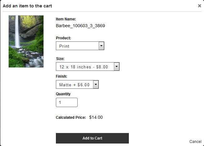
To illustrate the problem, here are two examples. This is what my Add to Cart box looks like (ignore the low prices, this is from a test site). I’m using a dark color for text on my site so everything shows up just fine.
But if I was using a dark background on my site with white text, this is what would be seen in the Add to Cart box.
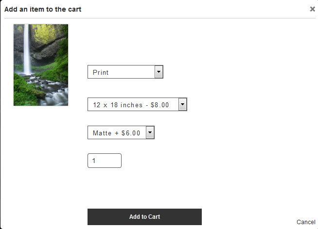
Notice the “missing” words. They’re still there, it’s just that the white text blends with the white background.
To remedy this, use custom CSS to change the text color to match the rest of the text.
The selectors to use are: #modal label and #modal p
In your custom css file, simply add:
#modal label, #modal p {

color: black;

}
Take complete control
If you want to take complete control of your Add to Cart dialog box, read on:
Below I’ve changed the coloring of the background and text to help show the CSS that controls the various elements.
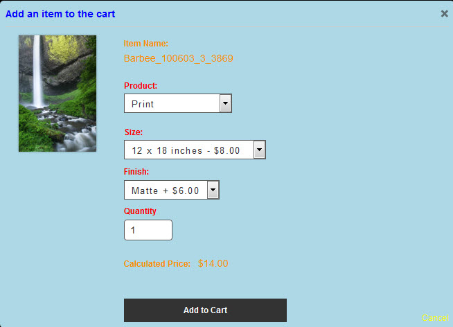
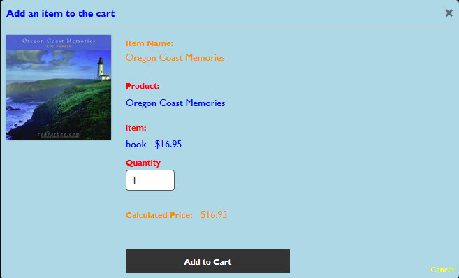
If your cart is set up with products that don’t have options (books, for example), you’ll see something different.
Text is actually styled from four different areas of CSS.
- The blue text comes from the cart CSS.
- The orange text comes from the gallery CSS (Paragragh color Site Info > Typography > color).
- The red text also comes from your gallery (or Pages if you’re using Shared Resources)
Site Info > Typography > color - The yellow of the Cancel text link comes from the cart CSS.
- The white of the Add to Cart button comes directly from your gallery or Pages (Shared Resources). It’s set in Site Info > Typography > Forms: button color
(You’ll notice that the red and orange actually come from the same place in the plug-in. However, they can be controlled separately with custom css)
You can control all these with custom CSS, though I suggest you set the colors for the button from within Lightroom.
Here are the CSS selectors for the rest:
The background color and the blue text: .mfp-content #modal
The orange text: #modal p
The yellow text: #modal fieldset#buttons button#cancelpurchase
And the red text: #modal label
Put it all together and here’s the CSS for the Add to Cart box seen above (the Add to Cart button is controlled from Lightroom):
/*Add to Cart pop up dialog box styling

==============================================================*/

.mfp-content #modal {

background-color: lightblue;

color: blue;

}

#modal p {

color: darkorange;

}

#modal fieldset#buttons button#cancelpurchase {

color: yellow;

}

#modal label {

color: red;

}
Just modify the colors to your liking. You can also use these selectors to change fonts, font styling, etc.
And if you want to take even greater control of your site’s styling, do what I just did to discover the needed selectors: use your browser’s Inspector.

And to stylize the price text below, we can control it by: #calculatedPrice and #calculatedPrice .unit_price
Here for example to make the final price bigger:
#calculatedPrice {
font-size: 30px;
font-weight: 400;
margin: 1.5rem 0;
}
#calculatedPrice .unit_price {
font-size: 30px;
font-weight: 400;
}