(Note: this was written back in the CE days when the css for the responsive grid was different than it is for Backlight. Since the Backlight, and thus the Backlight WordPress theme, no longer contains that css, the responsive grids below aren’t working. I’ll have to dig up the old css and add it to this post so that things will look right.)
One of my favorite features of the CE3 and CE4 versions of the TTG plugins is the Responsive Grid Framework. What this allows you to do is to use columns of text, giving your site more of a magazine feel. This way you can also group text into meaningful blocks. It works on the concept of dividing the page area into columns. In the case of the TTG Responsive Grid, this is either twelve or sixteen columns. You then set text block widths by assigning each a number of columns using a css class. For instance the class of “grid_4” will assign that block a width of 4 columns. If you’ve chosen a 12-column grid, then the “grid_4” class will take up one-third of the available area on the page. If you’ve chosen a 16-column grid, then the “grid_4” class will take up one-fourth of the available area. There are also classes that control the gutter width.
The Responsive Grid feature is also available in Backlight, there are some differences however. See this post on the Backlight version.
This does require that you know a little bit of html as well as the basics of how css works if you want to use it properly. I’m not going to go into step by step in this post as Matt’s pretty much covers that in the documentation here.
To use the code Matt provides, you could take it as is and replace the Lorem Ipsum text with your own while not touching any of the html tags, which is often what I do whenever I need to use it. Here I’ve just taken the code as is from the documentation. This uses a 12-column grid with the class “grid_4” assigned to each “block” of text:
Lorem ipsum dolor sit amet, consectetur adipiscing elit. Phasellus semper ipsum nibh. Proin vitae erat at enim semper placerat non in metus. Praesent et sodales orci. Maecenas tristique ultricies lorem non lacinia. Mauris sem elit, scelerisque vel laoreet at, placerat a nibh. In nec nunc vel neque sollicitudin euismod. Mauris vitae lorem dui.
Lorem ipsum dolor sit amet, consectetur adipiscing elit. Phasellus semper ipsum nibh. Proin vitae erat at enim semper placerat non in metus. Praesent et sodales orci. Maecenas tristique ultricies lorem non lacinia. Mauris sem elit, scelerisque vel laoreet at, placerat a nibh. In nec nunc vel neque sollicitudin euismod. Mauris vitae lorem dui.
Lorem ipsum dolor sit amet, consectetur adipiscing elit. Phasellus semper ipsum nibh. Proin vitae erat at enim semper placerat non in metus. Praesent et sodales orci. Maecenas tristique ultricies lorem non lacinia. Mauris sem elit, scelerisque vel laoreet at, placerat a nibh. In nec nunc vel neque sollicitudin euismod. Mauris vitae lorem dui.
You’ll notice that the font size is smaller than the rest of the page. That’s because of some inline styling Matt’s included in the main div container: style="font-size: smaller;". Depending on my needs I’ll either remove that or leave it be.
With the option of 12 or 16 columns and the included grid classes, you can add some visual interest to your site. You could set up a page that has a wide text block on the left, taking up two-thirds of the page, with a narrower block on the right, taking up one-third, like so:
Lorem ipsum dolor sit amet, consectetur adipiscing elit. Phasellus semper ipsum nibh. Proin vitae erat at enim semper placerat non in metus. Praesent et sodales orci. Maecenas tristique ultricies lorem non lacinia. Mauris sem elit, scelerisque vel laoreet at, placerat a nibh. In nec nunc vel neque sollicitudin euismod. Mauris vitae lorem dui.
Duis volutpat risus nibh, non molestie dui congue in. Vivamus aliquet risus a pretium volutpat. Vivamus bibendum ac nisi a hendrerit. Suspendisse volutpat vulputate lorem, posuere ultrices leo. In non est at neque pharetra accumsan eget sit amet turpis. Praesent rhoncus leo vitae risus egestas, ut rutrum sapien semper.
Lorem ipsum dolor sit amet, consectetur adipiscing elit. Phasellus semper ipsum nibh. Proin vitae erat at enim semper placerat non in metus. Praesent et sodales orci. Maecenas tristique ultricies lorem non lacinia. Mauris sem elit, scelerisque vel laoreet at, placerat a nibh. In nec nunc vel neque sollicitudin euismod. Mauris vitae lorem dui.
One of the great features of the Responsive Grid Framework is that it’s responsive (hence the name), just like all aspects of the TTG plug-ins. When the browser width narrows, the columns will collapse and stack one on top of the other. This maintains readability when viewing on mobile devices. Go ahead, try it yourself. If you’re reading this on a regular monitor, resize your browser window making it narrower and narrower.
The code Matt provides has the Lorem Ipsum text inside of paragraph tags. You can use any html you want inside of the responsive grid (but you can’t use Markdown) so that means if you need headings, just add them using html heading tags. Here I’m including the heading text wrapped in <h3> tags:
Heading 1
Lorem ipsum dolor sit amet, consectetur adipiscing elit. Phasellus semper ipsum nibh. Proin vitae erat at enim semper placerat non in metus. Praesent et sodales orci. Maecenas tristique ultricies lorem non lacinia. Mauris sem elit, scelerisque vel laoreet at, placerat a nibh. In nec nunc vel neque sollicitudin euismod. Mauris vitae lorem dui.
Heading 2
Lorem ipsum dolor sit amet, consectetur adipiscing elit. Phasellus semper ipsum nibh. Proin vitae erat at enim semper placerat non in metus. Praesent et sodales orci. Maecenas tristique ultricies lorem non lacinia. Mauris sem elit, scelerisque vel laoreet at, placerat a nibh. In nec nunc vel neque sollicitudin euismod. Mauris vitae lorem dui.
Add pictures if you like. You’ll need to style them with floats and margins or any classes you’ve made for images. There’s more here on using images in text blocks.
Heading 1
 Lorem ipsum dolor sit amet, consectetur adipiscing elit. Phasellus semper ipsum nibh. Proin vitae erat at enim semper placerat non in metus. Praesent et sodales orci. Maecenas tristique ultricies lorem non lacinia. Mauris sem elit, scelerisque vel laoreet at, placerat a nibh. In nec nunc vel neque sollicitudin euismod. Mauris vitae lorem dui.
Heading 2
Lorem ipsum dolor sit amet, consectetur adipiscing elit. Phasellus semper ipsum nibh. Proin vitae erat at enim semper placerat non in metus. Praesent et sodales orci. Maecenas tristique ultricies lorem non lacinia. Mauris sem elit, scelerisque vel laoreet at, placerat a nibh. In nec nunc vel neque sollicitudin euismod. Mauris vitae lorem dui.
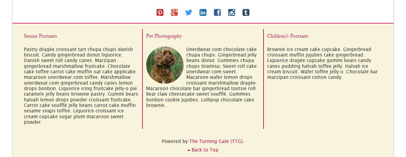
Spice it up
You can place a responsive grid in any text field in the TTG Plug-ins that also accepts Markdown. Those fields are marked (md). This includes the footer area. Just think of all the extra information you could add to your footer. Plus you can style it by adding custom classes or inline styles to the overall container and/or the block areas. Add a background color, borders, or more. Here I’ve just added a couple of borders. If you do add a responsive grid to the footer, you’ll probably also want to add a class to the main div element that will hide the grid with a media query on mobile devices, otherwise your footer will just get really tall when the columns collapse and stack. That could be an awful, ugly, depressing mess and no one wants that.
If you haven’t taken the Responsive Grid Framework for a spin, you really should, it adds a nice design touch to your text areas.