Pangolin Essay is one of my favorite new features in Backlight 4. It makes mixing of text and image grids and/or single images incredibly easy. It’s a great way to tell a story without the limits of the normal Pangolin album layout, with text either above or below the thumbnail grid.
If you’re not familiar with using Essay, see Matt’s video in the documents.
In an Essay album, when you select a group of images in a grid or a single image, all you need to do is copy the code and paste it into your album’s copy area. Add a heading and some text, pick your next group of images, and paste in the code and continue.
What you end up with is a page that has some text, and below that, a single or group of images, then below that some more text, then images, etc.
You may notice that all single images are centered on the page, as are the image thumbnail groups. What if you wanted to start your essay with a large image at the top of the page, floated to the left, with text to the right? This is actually easy to do.
Notice that the code you copy to insert the single images or grid of thumbnails is just html. It consists of a div containing data items.
<div data-presentation="single" data-images="818769_23150" data-presentation="single" data-images="818769_23150"></div>You can style this div with either inline styling or by using one of the alignment classes included with Backlight, or both.
Let’s say you want to start your essay with a single image floated to the left with text to the right, like in the image above. Just add the “alignleft” class to the opening div tag. You can also limit the width of the div containing the image with some inline styling: style=”width:400px;”.
<div class="alignleft" style="width:400px;" data-presentation="single" data-images="818769_23150" data-presentation="single" data-images="818769_23150"></div>The alignleft class floats the element to the left and at the same time adds some top, right, and bottom margin.
If you plan on doing this a lot, it makes sense to create a custom class to handle the width. Here I’ve added a class named “essay-single-400” after the “alignleft” class:
<div class="alignleft essay-single-400" data-presentation="single" data-images="818769_23150" data-presentation="single" data-images="818769_23150"></div>In my custom css I would create a rule:
.essay-single-400 {
width:400px;
}
(If you need to know how to create and add a custom css file, review this post.)
Or you could create a class that handles it all and apply that class instead:
.essay-alignleft-400 {
float: left;
margin: 0.25rem 1.5rem 0.25rem 0;
width:400px;
}
If you do this and the text you use doesn’t wrap around the image, you’ll need to add a clear to the next segment of text.
For example, you’ve added an image and floated it left and the text you include only comes down about three quarters of the height of the image. If you add more text, it will appear below the previous text and to the right of the image. If this is not what you want (like when you’re creating a new section of your essay) you’ll need to add a clear.
Usually, the next section will start with a heading. In this case, instead of using Markdown to create the heading, use html and add the clear:
<h3 style=”clear:left;”>Your heading</h3>Then just continue as normal.
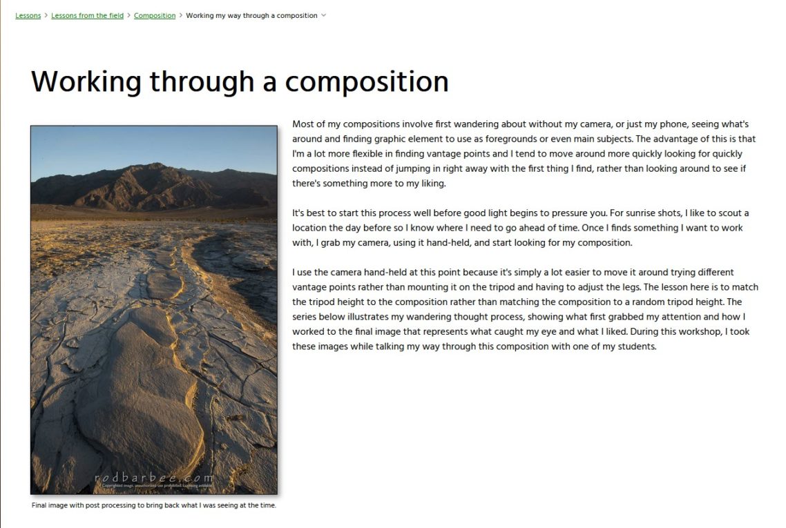
You can view the Essay album the above image was captured from by visiting the album on my website.
Variations:
One of my all-time favorite features in Backlight (it goes back to the old CE days) is the TTG Responsive Grid.
Using the Responsive Grid, you could place Essay single image divs or thumbnail grid divs inside one part of a TTG Responsive Grid and your text in the other part. That way, you could, for example, have two-thirds of a page taken up with an image grid and the other third with your text. As the viewport gets smaller (think tablets and phones), the Responsive Grid reforms, placing the images above the text (text above images is also possible) and making the page more readable.
This does require writing your text in html, but it opens up lots of possibilities. To learn more, read my TTG Responsive Grid in Backlight post.
Styling the images themselves
In the Essay album template, it’s easy to add borders to images and grid cells. You can even add shadows, they are very subtle and there are no customization controls for the shadows. If you like more defined box-shadows, like I do, you can add those via custom css.
Since Essay is built differently than regular Pangolin albums (for reasons), the image selectors are different and my global box-shadow custom css for images doesn’t work.
Using the browser Inspector, I found the needed selectors and was able to apply shadows.
Here’s the css for adding shadows to both single images and grid cells at the same time:
div[data-presentation="single"] figure a img, div[data-presentation="grid"] figure > div a img {
box-shadow: 4px 4px 8px rgba(0,0,0,0.4);
}
Adjust the box-shadow to your liking. For more on the CSS box-shadow property, look here.
I can see no way of applying shadows directly to the image thumbnails themselves. I believe this is due to how the Essay grids need to be created. I’m fine with that, the shadows on the grid cells looks great to me.
Let me know if you come up with any other customization ideas for Essay. It's a great new tool and I'm looking forward to seeing what others do with it.

This was EXTREMELY helpful, Rod! Thanks!
Thank you very much for this, Rod.
How are you able to display the metadata/ text under your styled image in the grid?
in the template, under Image Presentation: Single. There are options to display and style a caption.
Then in the Metadata Config section of the template, set the metadata token to use.