All those icons you see throughout your site: the little down arrows in navigation, the side arrows in breadcrumbs, the social media icons and the icons in the image menu of a standard album slide show, nearly all of them come from Font Awesome.
And Matt has licensed Font Awesome so that we, the users of Backlight, may use any of the Font Awesome 5 icons that we like.
So first, what is Font Awesome? It’s a collection of icons that you can use virtually anywhere on your site. Just go to the Font Awesome site and have a look around.
And second, where would you use them? Good question. The answer: lots of places throughout your site. How about your navigation menu. Would you like a house shaped icon to go along with the word “Home” in your menu? You can do that.
What if you want to change the map icon in your galleries? You can do that.
I’d first like to note that if you have updated from Backlight 2 to Backlight 3 and you’re having issues with icons on your site not appearing correctly, try editing your page template. Go to Design > Advances Setup, and under Font Awesome Version Support set Enable shims for Font Awesome 4 to ON.
Changing or adding Font Awesome icons by changing or adding html
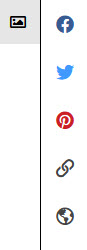
The Client Response add-on makes wide use of Font Awesome icons. In the Client Response add-on settings you can choose, via drop-downs, the icons used for Image Selects and Image Feedback.


Font Awesome icons are also used in the built in Gallery Help. Just scroll to the bottom of the template add-on to see the html in the Content / Legend / Help (md) field.
However, the icon code used there is based on the defaults chosen for the Client Response add-on. For example:
<div class="col_6 alpha">
<p><strong>In the image grid</strong>:</p>
<ul class="fa-ul">
<li><i class="fa-li far fa-heart"></i>Unselected Image; click icon to select</li>
<li><i class="fa-li fas fa-heart" style="color:#f44336;"></i>Selected Image</li>
<li><i class="fa-li fas fa-comments"></i>Leave feedback on an image</li>
</ul>
</div>>
The first two “heart” icons are for the selection icon in each thumbnail in the grid. The first (far fa-heart) is the outlined heart. The second (fas fa-heart) is the solid heart that appears when you click on the outlined heart to select the image.
(The fa-li preceding the icon code makes the items list items. This makes it so they act like list items and align as such.)
Like I said, the code in the Gallery Help reflects the template’s default settings. If you change the select icon to, say “Check Square,” the code in the Legend/Help section does not change. You will need to change the Font Awesome code to match your icon selection in the template.
Say you do change the Select icon to Check Square, then head over to the Font Awesome site and find the icons that match what you’ve chosen (search for “square”). For the square outline you’ll want “far fa-square” and for the checked square you’ll want “far fa-check-square.”
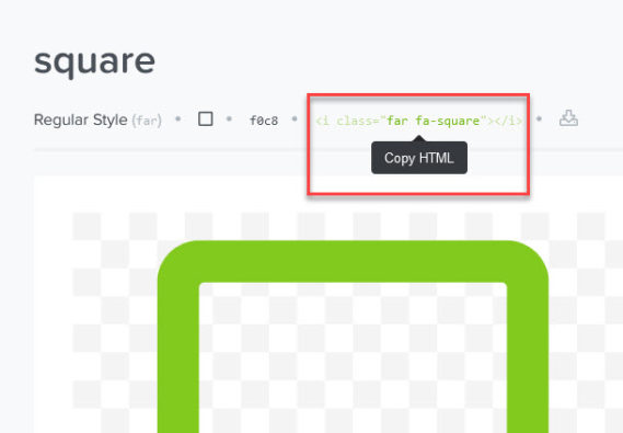
Then just change the code in your album template:
<div class="col_6 alpha">
<strong>In the image grid</strong>:
<ul class="fa-ul">
<li><i class="fa-li far fa-square"></i>Unselected Image; click icon to select</li>
<li><i class="fa-li fas fa-check-square" style="color: #f44336;"></i>Selected Image</li>
<li><i class="fa-li fas fa-comments"></i>Leave feedback on an image</li>
</ul>
</div>
Do the same thing with any other icons you need to change.
What if you want icons in your navigation menu? Just go to the Font Awesome site and find what you need. Then copy the html and insert it before or after the text in your menu item.
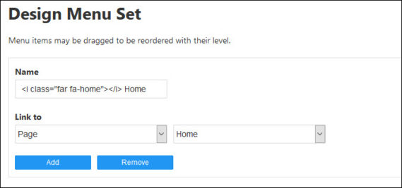
Want a house shape for the Home item? From the Font Awesome site, the html is:
<i class="far fa-home"></i>
In your menu set, in the Home page text, place that code and the word “Home.” Separate the two with a space.
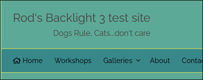
And this is what it looks like in the menu:
Custom CSS
For other applications of the icons, making these changes isn’t as straightforward. For example, changing the icons used in albums, either in the Single Image or Slideshow presentations. In those cases, you’ll need to use custom css to make the change. You’ll also need to identify the selector you need to use to apply the custom css.
As an example, you may want to change the default map icon. The icon is applied via css but there is no setting in Backlight to choose the icon. So the first thing to do is to identify the css selector being used to apply the icon. To do this, you’re going to have to use the browser’s built-in inspector. I’ve written some tutorials on using the inspector here and here and to an extent, here.
I use the slide show presentation in my albums, so I’ll use that example. To find the selector using the Inspector, go to where you can see the icon, in this case, that’s the large image view in the slide show presentation.
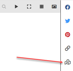
Right-click on the object you’re interested in. Note: if you’ve disabled right-clicking on your site (via phplugins and javascript) you’ll need to get to the inspector through the browser menu and then work your way through the html to the item you’re interested in.
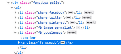 In the browser inspector, you’ll see some code highlighted. This may or may not be the exact code that you’re looking for but it will be close. You may need to expand code trees where you see right-arrows.
In this case, the html governing the map icon is the code highlighted. Sometimes you’ll need to dig down a little more. Look for the :before and :after pseudo-elements. The icons are often applied using one of these.
Next, look in the other pane of the inspector where you see the css rules controlling the style.
The content property is what’s inserting the icon:
content: "\f5a0";
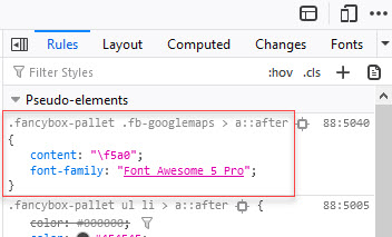
The next thing to do is find the icon you wish to use. Head over to the Font Awesome site and search for “map.” You’ll see lots of options. I’m going to go with one of the “globe” options. Click on the one you want and look below the name of the icon to see the codes that will insert the icon. Copy the unicode:

Paste the unicode (f57d) into your custom css file in place of the default (f5a0).
.fancybox-pallet .fb-googlemaps > a::after {
content: "\f57d";
}
Save the custom css file and upload it to your server. Go to your site and refresh the browser. Take a look at your new map icon.
You can use these techniques to add or swap out icons in all sorts of places on your site. However, they won’t work for Theater presentations or Galleria or the “Previous” and “Next” buttons in the Pangolin album slide show presentation since those third-party applications aren’t using Font Awesome for controls, etc.

Rod – I’ve started looking at using some of the icons for my website. Great tool! But I have a quick question for you. When I go to the Font Awsome site most of the icons are faded out and available only to Pro members. Are we restricted to just the free icons or is there a trick to accessing the rest?
Should be all of them. Try it out!
The reason they’re grayed out is probably because you aren’t logged into their site as a pro member. But you can still access the needed code.
I can’t fathom out how to add a standard Instagram logo to a BL4 design template. Could you help?
Here’s what I tried: In the “social media” section of the BL4 design template I inserted “” into the “icon” field – I got the code from the Font Awesome website after I’d searched for instagram. I put my instagram account in the “URL” field.
Here’s what I got: instead of a logo I got “id=”social_media”_01”> as written which is a hyperlink to the correct location (my instagram account.
How do I get a logo rather than words?
I’m trying to add a simple instagram logo to the top pallet in BL4. Instead of getting a logo I get the words “id=”social_media_01”> appearing in the top pallet. Here is what I tried: I inserted (which I got from the font awesome website by typing instagram in the search field) and in the “icon” field and a link to my instagram account in the URL field.
The link works fine but I can’t get a logo. What am I doing wrong.
Amendment to last comment: I’m trying to add a simple instagram logo to the top pallet in BL4. Instead of getting a logo I get the words “id=”social_media_01″> appearing in the top pallet. Here is what I tried: I inserted {i class=”fab fa-instagram”}{/I} (I’ve replaced < with { so that it doesn't get translated to html) which I got from the font awesome website by typing instagram in the search field and in the "icon" field and a link to my instagram account in the URL field.
The link works fine but I can't get a logo. What am I doing wrong.
Just type the word “instagram” (without quotes) into the icon field.
(See the instructions at the beginning of the Social Media section in the template.)
Oh. Sorry Rod, that was embarrassingly easy. I was following the Font Awesome link and using the instructions there. Thank you. Sorry too for the multiple posts I hadn’t realised he first one had gone through.
the posts required approval first and I approved them all at once. That’s why you didn’t see them.
all good though!